Halbe
Live www.halbe.coUI-UX Case Study 2023 · From Chaos to Clarity
"A new era of financial clarity where data-led decisions meet founder ambition."
The problem: Halbe's site read like an outsourced bookkeeping vendor, not the senior financial partner it actually is to its clients.
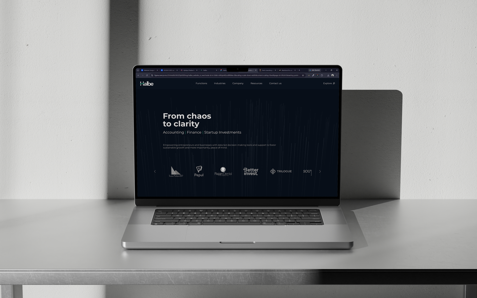
Context & Problem
Halbe is a financial services firm covering accounting & compliance, management consulting, and investment banking. The old website didn't match how they actually operate: as a senior financial partner to founders and family businesses, not a transactional vendor.
"Halbe unites the precision of accounting & compliance with the confidence of capital raising and personalized CFO guidance. The redesign needed to communicate that range, from GST filings to IPO advisory, without feeling scattered or overly corporate."
What the redesign covered
- Full IA overhaul across 3 financial verticals, restructured into 6 nav pillars
- Dual-persona homepage bridging fast-moving founders and cautious family businesses
- "Our Journey" growth timeline (2012 → 2024+) and a credibility-first homepage
What constrained it
- Heavy regulatory/compliance topics had to stay B2B-readable, not jargon-dense
- Had to avoid generic "startup fintech" tropes and keep a private-banking feel
- One IA had to serve both instant-scan and deep-read reading behavior at once
Single-Scroll Credibility
Let a fast-scanning founder evaluate track record, logos, and services in one homepage scroll.
Dual-Persona UX Bridge
Reconcile founder urgency with the cautious, relationship-driven depth family-business owners expect.
Legible Service Taxonomy
De-jargonize complex financial offerings into clear decision buckets.
Senior Partner Positioning
Shift brand perception from outsourced bookkeeping vendor to long-term growth partner.
Research: Who & How
There was no formal user research on this project, no primary interviews. The two personas below came from the client brief, some desk research into comparable B2B financial-advisory sites, and reasoning through two founder types that keep showing up in Indian SME and startup finance: the fast-moving founder, and the cautious, multi-generation family-business owner.
Aravind, 34
D2C Founder · BengaluruRunning a fast-growing D2C startup, juggling product, sales, and hiring. He sees finance as necessary but distracting, wants it handled by people he can trust, and prefers clear numbers over jargon.
- Overwhelmed by complex GST and tax compliance deadlines
- Burned by unresponsive, transactional accountants in the past
- Needs a partner who understands fundraising rounds, not just bookkeeping
- Fears messy books will trigger due diligence red flags with investors
Meenakshi, 52
2nd-Gen Manufacturing Owner · ChennaiRuns a manufacturing business she inherited from her father, and is now looking to professionalize it and eventually raise equity or go public. She values long-term relationships and proven experience over flashy branding.
- Struggles with outdated financial processes & unclear cash flow visibility
- Cautious about outside advisors; needs deep trust built over time
- Wants a firm that respects legacy values while modernizing operations
- Uncertain how to prepare internal systems for equity dilution or IPO
Shared Goals Across Both Personas
| Evaluation Vector | Transactional Vendor (Status Quo) | Halbe Senior Financial Partner |
|---|---|---|
| Service Perception | Outsourced GST/bookkeeping commodity vendor | Strategic CFO partner scaling alongside founder ambition |
| Homepage Experience | Jargon-dense text blocks requiring deep reading | Single-scroll proof: Logos, case study impact, & capability cards |
| Client Growth Arc | Static tax filing services without growth continuum | Explicit roadmap: Accounting (2012) → CFO (2016) → M&A/IPO (2024+) |
| Trust Building | Generic corporate buzzwords buried in footer links | Early proof points: Real client metrics & founder video stories |
Insight → Decision
What each assumption actually changed in the design, not just what was concluded but what it caused.
Aravind wants credibility proof fast, with zero patience for jargon.
Client logos, case-study thumbnails, and testimonials placed before any hard sell, in a single-scroll homepage.
Meenakshi needs slow, relationship-driven trust, not flashy branding.
Dual-entry IA: Capabilities and Industries live both inline on the homepage and as dedicated deep-dive pages.
Both personas get lost across 40+ jargon-heavy financial services.
Services regrouped into 6 plain-language navigation pillars via card sorting: Home, Functions, Industries, Company, Resources, Contact.
Both want proof the firm scales with them long-term, not just files taxes.
"Our Journey" timeline (2012 → 2024) visualizing growth from bookkeeping to CFO services to investment banking.
Structure & Flows
Halbe's service spectrum (accounting, management consulting, investment banking) organized into 6 navigation pillars through card sorting.
Designed so fast-scanners (Aravind) get full context on Home, while deep readers (Meenakshi) explore sub-sections.
"Our Capabilities" and "The Industries" both appear directly on the homepage and as full dedicated sections. That lets a fast-scanning founder get the gist in one scroll, while a cautious reader can dive deeper into dedicated sub-pages through the top nav.
Visual Identity
The typeface and palette behind the "private banking" feel the redesign was built around.
Typography
Montserrat: Chosen for modern, geometric readability that reads as confident and professional without feeling cold.

Color Swatches
A deep navy-black (`#0B1523`) paired with a single confident teal accent (`#258F73`) gives the site a "private banking" feel rather than a generic startup-fintech look. It reinforces the senior financial partner positioning.
Design Walkthrough
Three key pages, straight from the shipped Figma file. This is where the structure above actually landed.
01. Home: the single-scroll credibility flow
Hero promise → 3 proof-point case studies → capability breakdown → industries → client stories → testimonial → CTA. Built for Aravind to get the full pitch without leaving the page.
02. Company: the deep-trust page
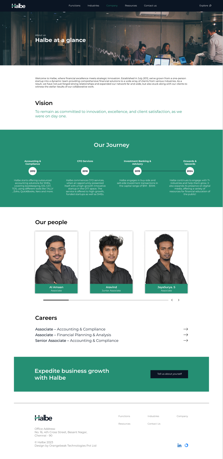
"Halbe at a Glance," Vision, and the "Our Journey" timeline. This is the slower, relationship-first content Meenakshi needs before she'll take a call.
03. Resources: proof instead of adjectives
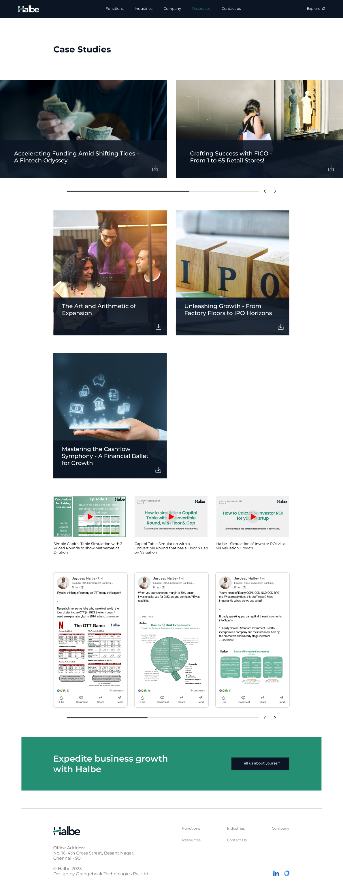
Case studies and published work stand in for claims. Real client outcomes instead of marketing language.
Validation
An unmoderated round tested whether people could navigate the 6-pillar IA and find what they needed. It was a small group: real target users (founder and business-owner profiles), plus a few Orangebeak team members standing in as extra testers. The structure held up. No navigation confusion surfaced, and the existing IA didn't need to change.
The Resources page saw about 20% higher engagement than other sections within the test. That was the clearest signal that the credibility-first, proof-over-claims approach was actually landing.
Alongside the formal test, feedback kept coming in informally, from both the Halbe client and the Orangebeak team, across design review and again once the site went live. Most of it just confirmed the direction, but one round actually changed something.
A plain contact-information page: address, form, done.
A purpose-filtering intake form. Every inquiry arrives pre-tagged with what the person actually wants, instead of landing as one generic message.
Outcome
Shipped & Live
CONFIRMED- Live in production at halbe.co, replacing the firm's previous website
- 40+ services regrouped into 6 navigation pillars, shipped as-designed
- Dual-entry IA pattern shipped on both Home and Company/Industries pages
Validated in Testing
VALIDATED- Unmoderated testing confirmed the 6-pillar IA needs no rework, with no navigation confusion surfacing
- Resources page saw ~20% higher engagement than other sections within the test
- Ongoing client/team feedback drove one real change: Contact Us became a purpose-filtering intake form
Reflection
The usability round confirmed the IA holds up, and it surfaced a real signal: people engaged noticeably more with the Resources page. But it was a small, unmoderated test, not real production traffic. If I revisited this today, I'd want actual analytics tied to the live site to see whether that pattern holds at scale, and I'd still want to validate the two personas with real conversations instead of just desk research.