Safr
Visit PrototypeThe Digital Afterlife: Navigating the Crisis of Data Inheritance
"A safe space for what matters. A gentle space to preserve what matters most."
The problem: India's digital security is built for a user who never dies, so grieving families get locked out of the accounts and memories they're legally entitled to.
Context & Problem
Safr is a mobile-first system designed to close the gap between human mortality and the permanence of the Indian digital identity. It's a digital inheritance and "Grief-UX" platform: a structured, empathetic way for people to pre-plan the handover of their digital and financial assets, and for grieving families to access, manage, and close those assets without being blocked by security systems built for a user who never dies.
The project frames a real, largely unaddressed financial crisis, over ₹50,000 crore in unclaimed assets sitting with Indian institutions due to poor estate planning, as fundamentally a UX problem, not just a legal or fintech one.
What the project covered
- Full lifecycle: pre-planning, bereavement handover, legal support
- Six functional pillars: Assets, Vault, Privacy, People, Resources, Support
- A dedicated Bereavement Mode with distinct navigation and workflows
- Coverage across banking, social media, SME accounts, crypto, subscriptions, legal vaults
- Multi-language support (English, Hindi, Marathi)
What constrained it
- Had to work within Indian legal infrastructure: Aadhaar KYC, DigiLocker, GST Portal, Succession Certificates
- Security built for living users (2FA, biometrics) acts as a barrier for grieving heirs
- Spans wildly different digital literacy levels, a 63-year-old homemaker and a 32-year-old lawyer
- An emotionally high-stakes context that constrains tone, pacing, and microcopy tightly
1. Make Invisible Risk Visible
Surface how much wealth and digital legacy is at risk of being permanently lost due to missing nominations.
2. Heir-Centric Verification
Design security and verification flows that work for a grieving heir instead of against them.
3. Separate Legacy from Shadow Data
Distinguish public memories (photos, vlogs) from private shadow data (chats, drafts) with explicit opt-out agency.
4. Single Death Certificate Verification
Reduce administrative burden: one verified Death Certificate unlocks a guided path across banking, social, business, and subscriptions.
Non-linear navigation, dead-end UX prevention, dual process model, cognitive load reduction.
Opt-out agency, digital afterlife settings, legacy contact permissions, shadow data control.
Thanatosensitive design, secondary user flows, positive friction, compassionate microcopy.
Offboarding protocols, DigiLocker integration, legal succession checks, data portability.
Research: Who & How
Around 6 to 10 people were involved: a mix of real families with direct experience of digital inheritance or asset transfer after a death, and industry experts (finance and legal professionals). The three household scenarios below and the personas within them come from that fieldwork, alongside a desk audit of comparable Indian products (Yellow, MyVirasat, DGLegacy, and mainstream brokerages).
Market Comparison: Digital Inheritance (India)
| Product | Asset Coverage | Handover Trigger | Grief-UX Quotient |
|---|---|---|---|
| Yellow | Comprehensive: Bank, Demat, Property, Digital | Manual/Guided: Heir-initiated with legal help | High (Empathetic UI) |
| MyVirasat | Focused: EPF, PPF, Insurance, Physical Docs | Manual/Assisted: Human-led recovery | Medium (Service-heavy) |
| DGLegacy | Digital: Passwords, Crypto, Vault Files | Automated: Heartbeat inactivity detection | Low (Tech-centric) |
| Indian Brokerages | Siloed: Demat & Mutual Funds only | Passive: Bureaucratic claim process | Low (Friction-heavy) |
Deceased: Mr. Arvind, 68 (Retired Official)
Digitally active but keeps passwords in misplaced physical diaries. Outdated nomination lists his late brother.
Heir: Mrs. Sarita, 63 (Homemaker)
Uses WhatsApp, avoids money apps out of scam fear. Locked out of family savings after Arvind's cardiac arrest.
Deceased: Ishaan, 29 (UI Designer & Vlogger)
A massive digital footprint (Google Photos, Instagram, crypto, 15+ SaaS subscriptions). Private chats mixed with family photos.
Heir: Meera, 32 (Corporate Lawyer)
Wants to preserve videos but is hounded by "Subscription Overdue" emails with no way to cancel without his card.
Deceased: Rajesh, 52 (Small Factory Owner)
GST filings and factory payroll tied to his personal phone and DigiLocker. Sole admin of the business's digital identity.
Heir: Rohan, 24 (Son, Recent Graduate)
Must prove legal succession to the bank and GST office, but systems keep sending OTPs to his father's dead SIM card.
Insight → Decision
What each finding actually changed in the design, not just what was concluded but what it caused.
Usability testing showed grieving users hit heavy cognitive load trying to fill long forms.
This became the foundation for the Grief-UX "Bereaved" lens: non-linear navigation, a dual process model, and cognitive load reduction as explicit design guidelines, not just a nice idea.
Every comparable product either covers assets comprehensively or handles grief with empathy, never both.
Safr's whole premise: combine comprehensive asset coverage with a genuinely empathetic, guided handover, the specific white space no competitor occupies.
Heirs like Sarita don't know what a Demat account is, and get asked to claim one anyway.
Native-language explanations of financial terms appear before any claim action, not buried in help docs.
Security built for the living (OTPs to a dead person's SIM) actively blocks legitimate heirs like Rohan.
Single Death Certificate and Succession Certificate verification unlocks a guided path across banking, social, business, and subscriptions at once.
Structure & Flows
Card sorting organized the app into 6 functional domains before any screen was drawn.
Authentication
Pre-Planning
Bereavement
Business
Support
System
Visual Identity
A calm, low-saturation palette built to feel supportive rather than clinical, at a moment when most fintech UI reaches for urgency and speed instead.
Color Swatches
Design Walkthrough
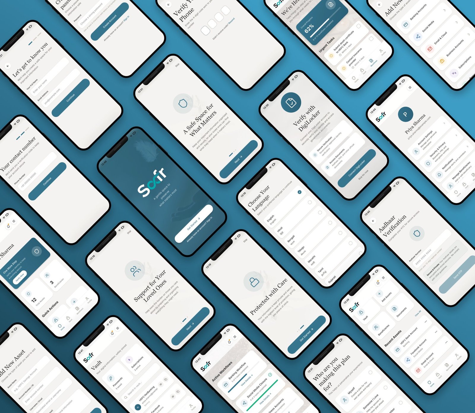
Real screens from the prototype, where the framework above actually landed.
The full flow, in motion
Onboarding and identity verification (DigiLocker, Aadhaar), the day-to-day dashboard and vault, and the bereavement-mode workflow: "We're Here for You," urgent tasks, guided account closures.
Onboarding: setting the tone before asking for anything
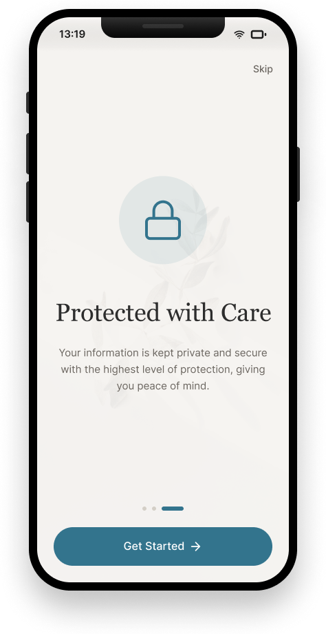
Protected with Care
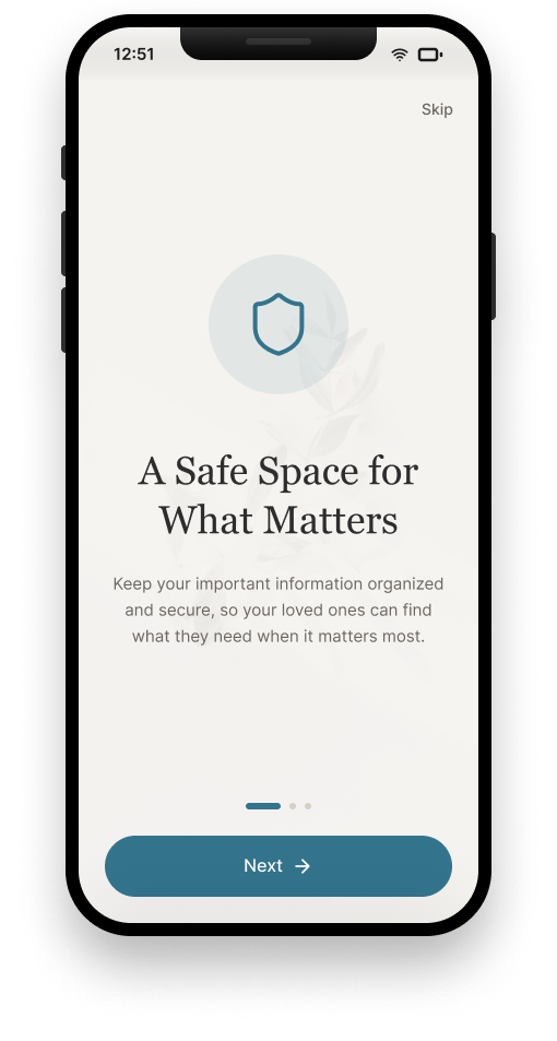
A Safe Space for What Matters
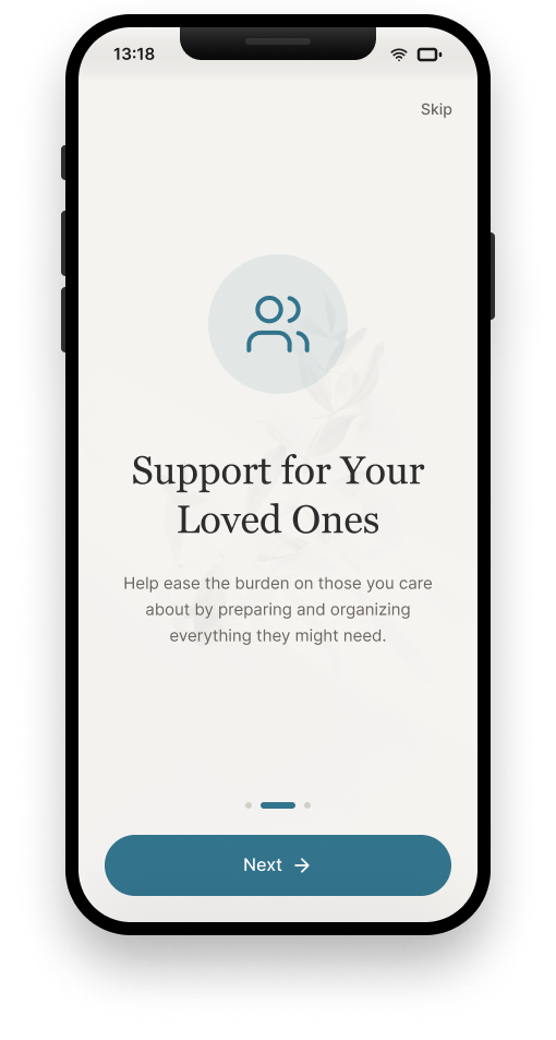
Support for Your Loved Ones
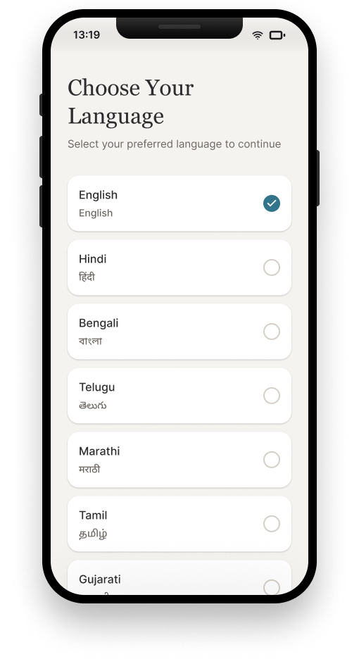
Choose your language, first thing
Account creation & security
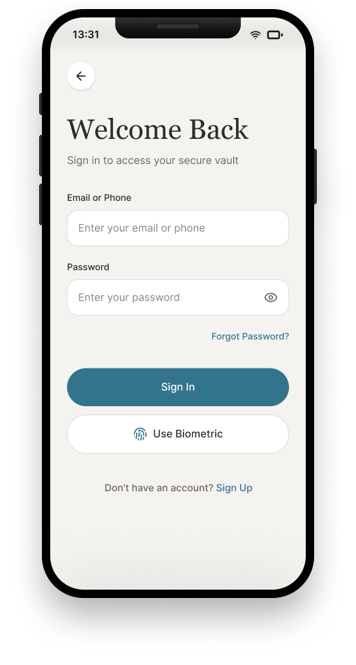
Sign in / biometric option
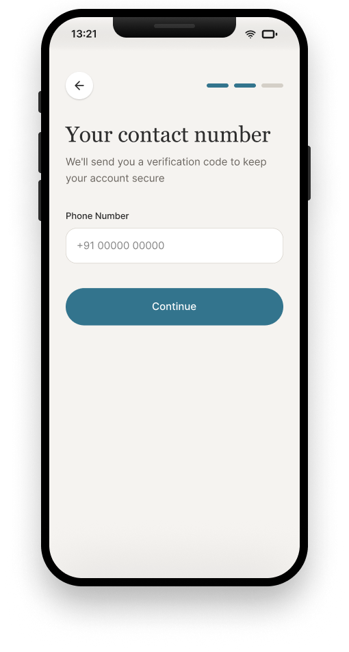
Phone number entry
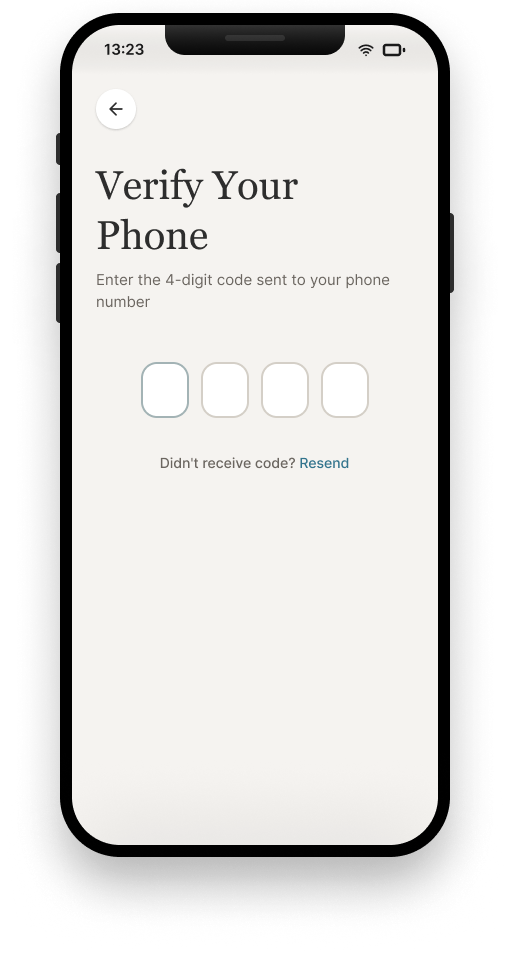
OTP verification
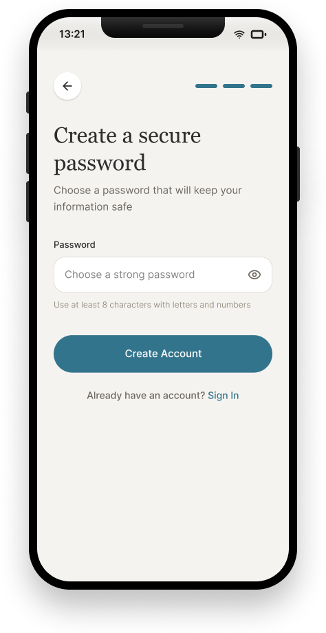
Create a secure password
Getting to know the user, and verifying them
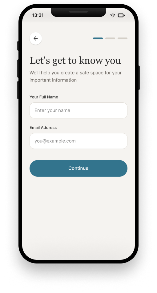
Let's get to know you
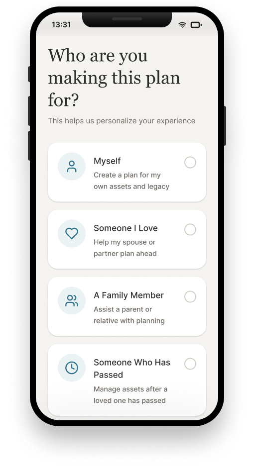
Who this plan is for
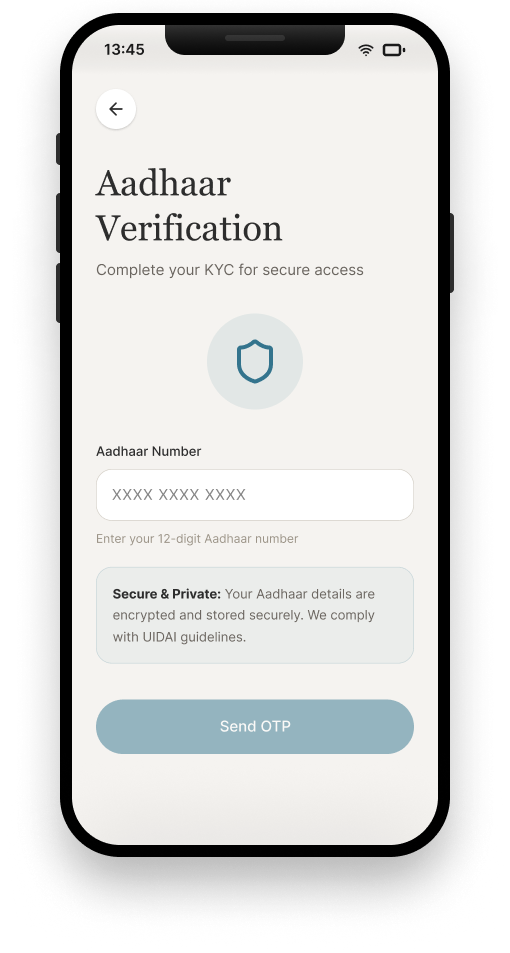
Aadhaar KYC
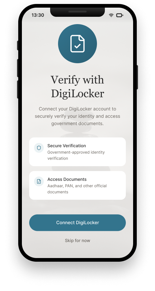
Verify with DigiLocker
Home & everyday use
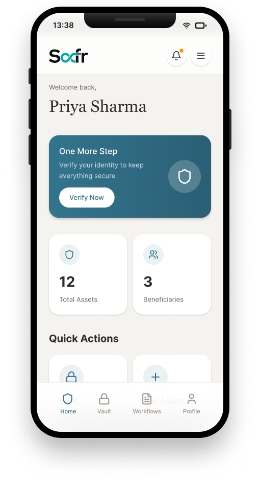
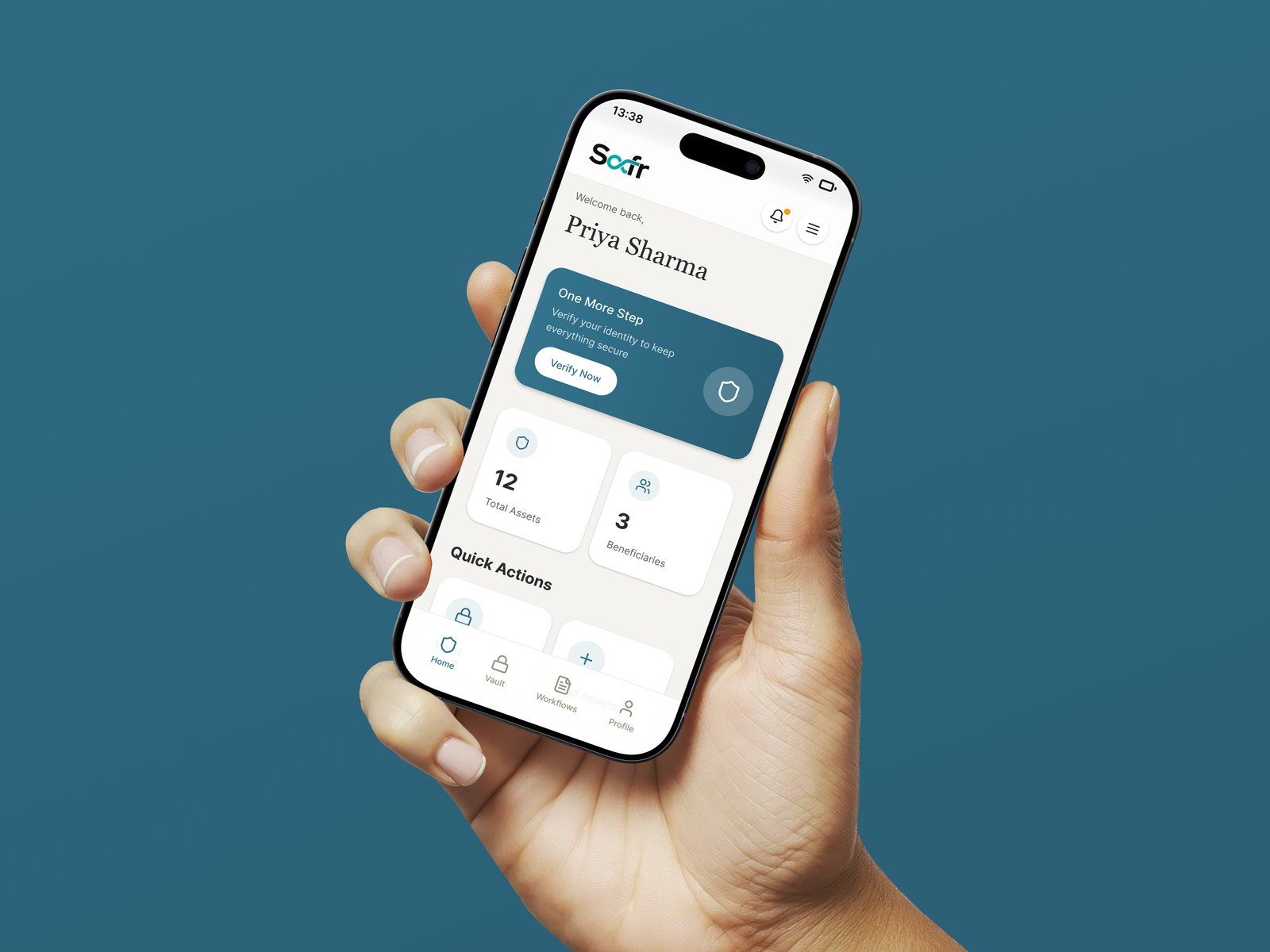
Dashboard: assets & beneficiaries at a glance
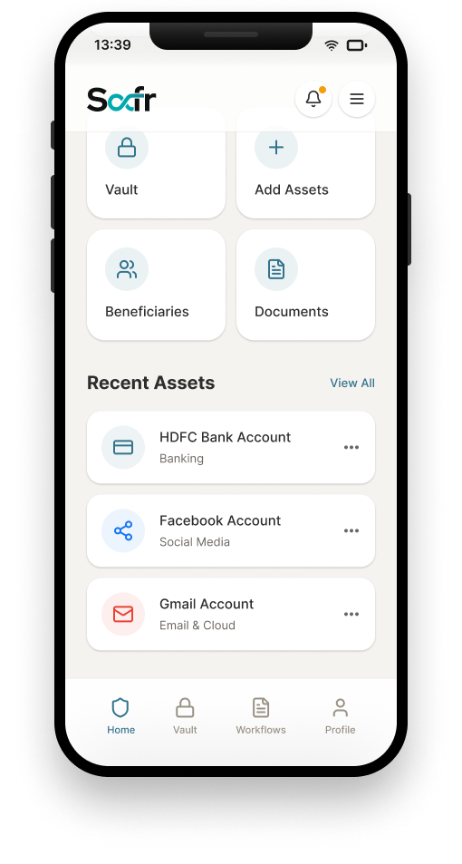
Quick actions & recent assets
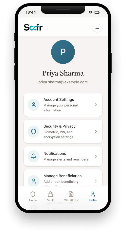
Account settings
Vault & assets
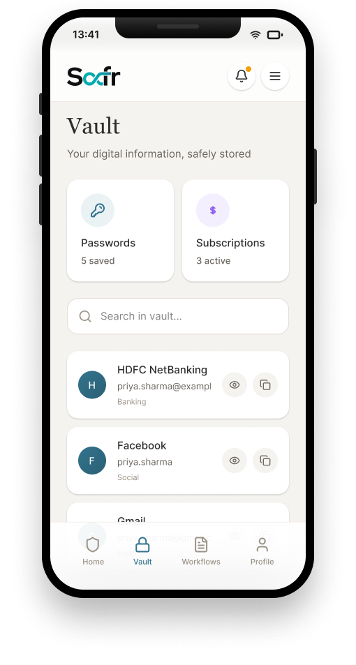
Passwords & subscriptions vault
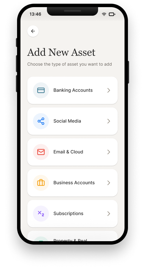
Add New Asset: choose a type
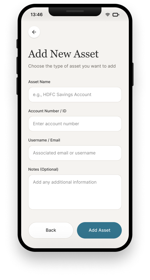
Add New Asset: the form
People: nominees & beneficiaries
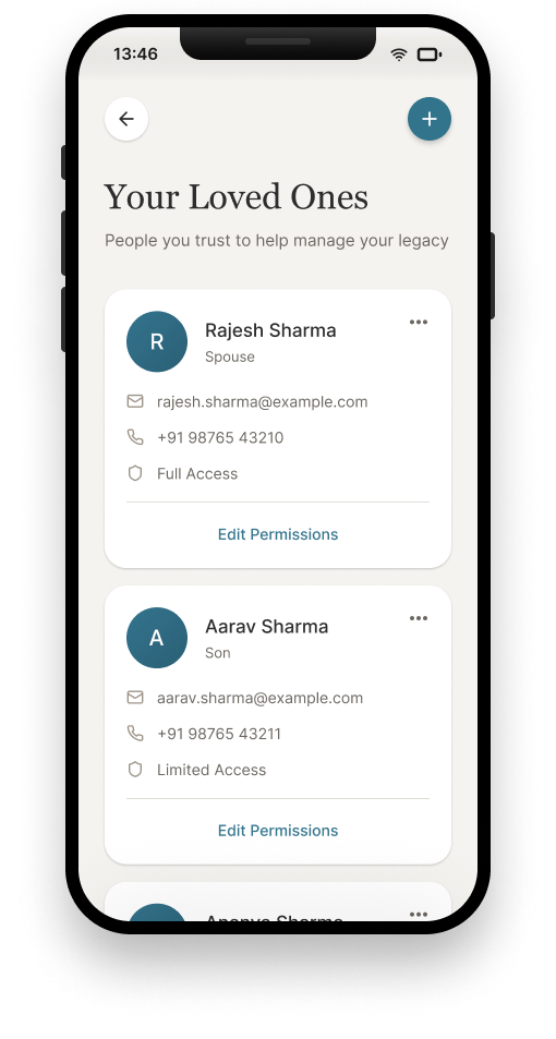
Your Loved Ones, and their access level
Bereavement Mode: the guided handover
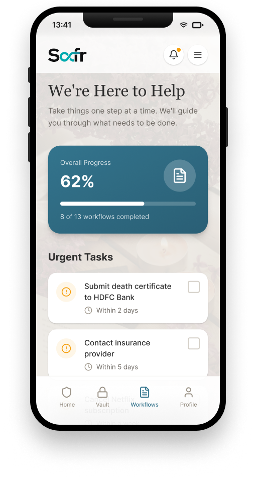
We're Here to Help: overall progress & urgent tasks
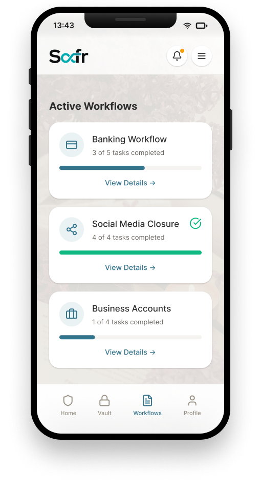
Per-account workflow progress
Validation
Usability testing covered two flows: the bereavement-mode workflow (reporting a death, closing accounts) and onboarding/asset-adding while alive. Real people took part, not just internal review.
The clearest finding: grieving users hit real cognitive load trying to fill long forms. That single insight became the basis for the Grief-UX framework's cognitive-load-reduction guidelines, not just a design nicety.
Outcome
Delivered
CONFIRMED- Grief-UX framework defined and applied across all 6 functional pillars
- 3 paired household scenarios, grounded in real fieldwork, shipped as personas
- Full mobile IA and card sort delivered, including a distinct Bereavement Mode
Validated in Testing
VALIDATED- Bereavement-mode and onboarding flows both tested with real users
- Cognitive-load problem on long forms identified and fed back into the framework
- Personas confirmed against real household interviews, not just assumed
Reflection
The cognitive-load finding was the most useful thing testing surfaced, it turned "Grief-UX" from a framing device into an actual constraint on every form in the product. If I revisited this today, I'd want to test the Bereavement Mode specifically with people currently going through a real loss, not just people recalling one, and I'd want real analytics on where in the multi-step verification flow people actually give up.